Skip to content
  • Home
  • About
  • Contact
Search
Close

L.T. Hanlon

Category: Publishing

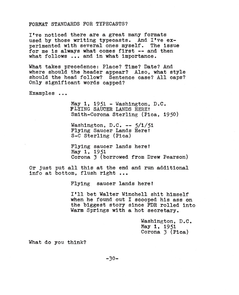
Should typecasts have a standard format?

August 12, 2019August 12, 2019 L.T. Hanlon7 Comments

This photo is of a typewritten page with text that can't be easily duplicated in linear form that doesn't have line breaks. Basically, I discuss whether typecasts should have a standard design and whether headlines, dates, or typewriter used should presented first.

Share this:

  • Tweet
  • Click to print (Opens in new window) Print
  • Click to email a link to a friend (Opens in new window) Email
Like Loading...

Serif or sans serif?

May 14, 2019May 14, 2019 L.T. Hanlon7 Comments

Photo is of a typewritten page with the following text, which varies between serif and sans serif typefaces. Tuesday, May 14, 2019. Chicago, USA. To serif or not to serif. I've always preferred using a serif typeface for body text; the legs and feet just always seemed to make it easier to read. At newspapers where I worked, the house style often dictated serif for body type and sans serif for captions. The exception was so-called advertorial, aka advertising designed to look like real news. This usually employed sans serif for body type as a way to make it appear different from regular news content. In my experience, however, serif or sans serif never made that big a difference when it came to editorial vs. advertorial because most newspaper readers have been — and continue to be — unaware of the difference. But I have warmed to the quasi-sans typeface used in this Hermes 3000 typewriter from 1968. Its typeface, Techno Pica, feels like a serif face sometimes and sometimes like a pure sans serif. Only a few letters sport serifs, others don't — but I 'm unable to figure why. The photo shows an example of Techno Pica typeface, which is mostly san serif except for a handful of exceptions. I can sort of see why the serifs. You don't want a lowrcase ell to be mistaken for a sans serif numeral one. So in Techno Pica, both are unique. Tis a mystery.


Share this:

  • Tweet
  • Click to print (Opens in new window) Print
  • Click to email a link to a friend (Opens in new window) Email
Like Loading...

Posts navigation

Newer Posts
December 2025
S M T W T F S
 123456
78910111213
14151617181920
21222324252627
28293031  
« Oct    
Follow L.T. Hanlon on WordPress.com

It’s a big, wide wonderful world

I fully accept Charles Fort’s observation that one measures a circle beginning anywhere.

Blogroll

  • Antique Typewriter Collecting by Tony Casillo
  • Codes of the West
  • Imperium Romanum
  • J. Allen Hynek Center for UFO Studies
  • Jeff Rense
  • Joe Van Cleave
  • Library of Congress — Photos
  • Macroevolution.net
  • Pen Vibe
  • Pulp International
  • RadioJayAllen
  • Spudart
  • Streamliner Schedules
  • Taos Hum
  • The Classic Typewriter Page
  • The Payphone Project
  • The Rt. Rev. Theodore Munk
  • The Untimely Typewriter
  • Trailways Forever Memories
  • Typewriter Review

My Flickr Photos

000231320010 copy000231320008 copy000231320003 copy000231320005 copy000231320006 copy000231320001 copy000231300009 copy000231300006+5 Anaglyph000231300002+1 Anaglyph
More Photos
Create a website or blog at WordPress.com
Back to top
  • Subscribe Subscribed
    • L.T. Hanlon
    • Join 46 other subscribers
    • Already have a WordPress.com account? Log in now.
    • L.T. Hanlon
    • Subscribe Subscribed
    • Sign up
    • Log in
    • Report this content
    • View site in Reader
    • Manage subscriptions
    • Collapse this bar
 

Loading Comments...
 

    %d