The awesome legacy of ‘Land of the Giants’

Main title logo for the first-season opening of Irwin Allen's "Land of the Giants."


Land of the Giants” is a classic piece of science-fiction television history. Despite only airing for two seasons between 1968 and 1970, it established a robust presence in the genre. The series remains noteworthy with its thoughtfully blended narrative, ideas, and enduring special effects.

The show was developed by producer Irwin Allen, who effectively amalgamated elements from literary and cinematic works like “Gulliver’s Travels,” “Dr. Cyclops,” and “The Incredible Shrinking Man.” Allen’s synthesis of these and other sources gives “Land of the Giants” a unique flavor, leveraging established ideas to create an innovative and exciting narrative.

However, one significant criticism of “Land of the Giants” is its character similarities to another Allen production, “Lost in Space.” The prescient child and the cunning troublemaker found in both shows create a unpleasant sense of déjà vu. While not negating the originality of “Land of the Giants,” this structural mirroring makes it feel needlessly derivative.

On the plus side, the show effectively updated the premise of the most memorable segments of “Gulliver’s Travels,” infusing it with science-fiction elements. It explored power dynamics as symbolized by size, drawing inspiration from “Dr. Cyclops,” and, like “The Incredible Shrinking Man,” used size reduction to magnify life’s essential questions.

Additionally, “Land of the Giants” deserves commendation for its impressive special effects. Despite the technological constraints of its era, the show produced a believable world of giants. Its ability to deliver visually, even after half a century, is a testament to the skill and creativity of its production team.

“Land of the Giants” holds a special place in the history of science-fiction television. Despite its short lifespan, it showed an innovative approach to storytelling, combining thoughtful narrative with compelling visuals. It remains a reference point for the genre, a testament to its well-executed design and timeless appeal.

Original Concept Artwork from Land of the Giants (Irwin Allen Productions, 1968-1970). Vintage original concept art from The Land of the Giants in tempera and gouache, measuring 19-¾" x 30" on 4-ply artist board, glue tipped to a mat measuring 24-½" x 35" and hinged with transparent mylar overlay. The pre-production artwork depicts the crew in "Spindrift" being examined by a giant piercing eye.
If you’re an Irwin Allen fan and have some spare cash, check out the storyboards, concept art, publicity material, and toys from his movies and TV shows now up for grabs at Heritage Auctions. This pre-production artwork depicts the Spindrift crew encountering a giant. (Imaged by Heritage Auctions)

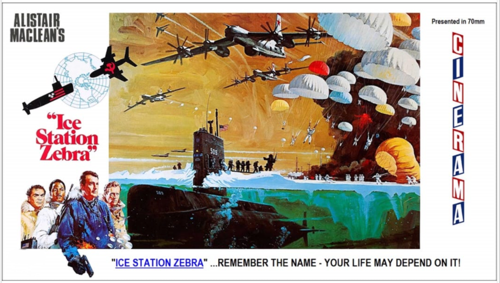
‘Ice Station Zebra’ is the perfect movie title

Poster art for 1968 film "Ice Station Zebra."


As a film viewer, one’s relationship with movie titles is like a sommelier’s with wine labels. Both encapsulate entire universes of experience in a few choice words. They are a prelude, a tease, an overture.

Over the decades, I’ve pondered upon hundreds of these word-woven spells, from the beguilingly simple “Jaws” and “Psycho” to the grandly pompous “The Magnificent Ambersons” and “Lawrence of Arabia.”

After all these years, however, one title has held me in its icy grasp: “Ice Station Zebra.”

Here’s why.

A title must be succinct but also evocative. It must tickle curiosity but only divulge a little. Now, consider “Ice Station Zebra.” It’s three simple words. Ice. Station. Zebra. Each is mundane. But together, they conjure up an image at once bizarre and intriguing. What is this icy station? And, pray tell, what is a zebra doing there?

The first two words, “Ice Station,” present harsh, chilly remoteness. Think about it. Any title beginning with “Ice Station” promises a grueling adventure in a frosty, desolate landscape. As audiences, we are immediately transported into a realm far removed from our comfortable living rooms. The tension is palpable.

Then comes the zinger: “Zebra.” What an unexpected departure. It’s like taking a left turn at Albuquerque on your way to Seattle. Suddenly, the mundane “Ice Station” transforms into a mysterious, surreal landscape. The contrast of a zebra’s stark stripes against the white snow brings a delightful paradox, a twist that one can hardly resist.

“Ice Station Zebra” also has the advantage of perfect context. The film is a Cold War thriller based on a novel by Alistair MacLean, released at the height of the space race in 1968. The title’s chilly nuances echo the frosty U.S.-Soviet relationship. The “Zebra,” a code name, hints at espionage, covert operations, and secrets buried beneath layers of ice and intrigue.

Perhaps most important, “Ice Station Zebra” doesn’t overpromise. It’s not “The Greatest Story Ever Told.” It doesn’t pronounce itself as “Unforgiven.” It’s understated yet compelling. It’s unassuming yet unforgettable.

The artistry of a movie title lies in its ability to capture the essence of a film and yet leave ample room for imagination. By that measure, “Ice Station Zebra” is a testament to the art. It stands as a bold beacon in the wintry white landscape of cinema, a lighthouse guiding curious audiences to the warmth of a riveting tale. It is a perfect title, a zebra among horses. A paradox, a poem, and a promise all rolled into one.

So here’s to “Ice Station Zebra.” Long may it reign in the frosty kingdom of movie titles. We might all be a bit warmer for it.

I saw this epic film first-run in 70mm at Denver’s Cooper Cinerama Theater.

Chi-Town smoked: Not the kind you BBQ

Smoke from Canadian fires reduced visibility in Chicago. (Photo courtesy Arnold Coobee)


CHICAGO — Picture this: You step outside, ready to embrace a beautiful summer day in the Windy City, and you’re met with an ambiance that’s more Smokey Bear than smoky bar.

Tuesday, June 27, 2023, was such a day for Chicagoans as smoke from Canadian wildfires suffocated our beloved skyline. The Great White North’s blaze exports have turned our city into the world’s largest smokehouse. And we aren’t talking about the delectable smoke that graces our taste buds at a weekend cookout.

Arnold Coobee, a resident of the Streeterville neighborhood, summed up the situation for many of us: “My neighborhood smells awful today. The odor is like burned hotdogs.”

Poor Mr. Coobee. If only we were dealing with overcooked frankfurters, not the health hazard of wildfire smoke.

The aroma may be unpleasant, but the smoke is worse than a nasal nuisance. It’s downright dangerous. It’s like giving Mother Nature a pack of cigarettes and asking her to blow smoke in your face.

The elderly, young, and those with pre-existing health conditions are the most at risk. The air is toxic, hazardous, and in your lungs right now if you’re in the city.

So next time, dear Canada, please keep your wildfires to yourselves. We have enough to deal with without adding “respiratory health risks” to our docket.

Until then, we’ll be over here, holding our breaths and longing for the good old days of clean air and city smog.

Handling yesterday’s embarrassing crime stories

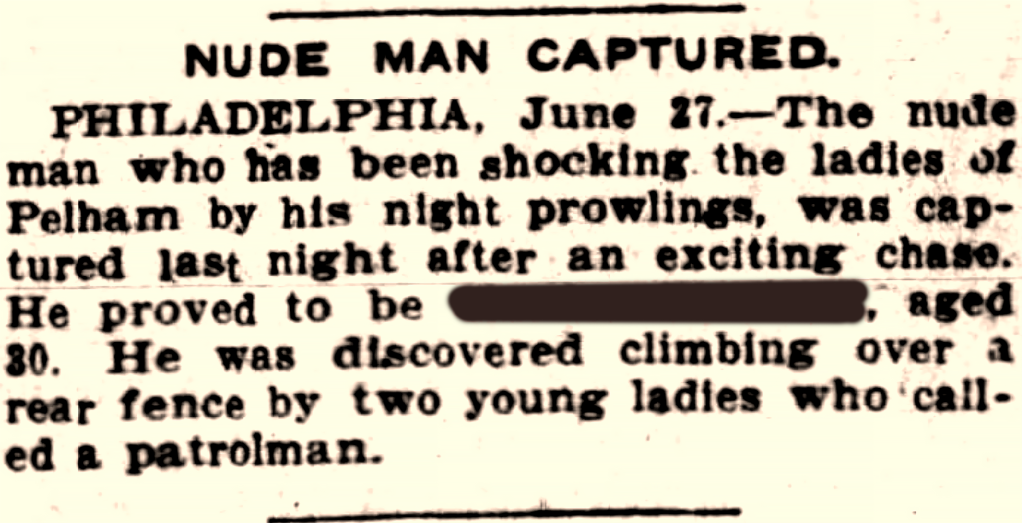
This brief news story appeared in the June 27, 1906, edition of the Wilkes-Barre (Pennsylvania) Leader. In 1970, the paper published a death notice for a man of the same name.


I enjoy traipsing through police-blotter coverage of yesteryear, and I especially linger over panty thefts, public nudity, and other embarrassing revelations.

When I post such stories here or on Facebook, I’ll redact both victims and suspects. I figure that the initial public shame was enough.

When I began my journalism career over 40 years ago, newspapers routinely printed the names of victims and suspects, even in sexual assault crimes.

Things are different now.

Gone are the days when newspapers, those paragons of papery veracity, were unabashed in their inky declarations of guilt and victimhood. Once merely suspected, suspects found themselves as infamous as a peacock at a penguin gathering, and the victim, well, became no less a public spectacle.

The presumption of innocence was soaked in the cold ink of print, wrung dry by the iron press of public opinion. There was a crude democracy to it, a collective societal reckoning — the bitter taste of a public pillory distilled into newsprint.

Contrast that with the pusillanimous journalism of today, where the specter of libel looms large, where delicate sensibilities are swaddled in the gauzy shroud of anonymity.

Today’s scribes, armed with their stylish quills and wary of wielding their words as swords, tip-toe gingerly on the thin ice of legal ramifications.

The suspects remain vague, ghostly apparitions in a twilight world, named only when their crimes possess a certain grotesque grandeur that ignites public curiosity.

We’ve traded in our broadsheets of brazen disclosure for a more cautious, considerate news dissemination. The query is: Does this new order protect the innocent, or does it merely cushion the fall of the guilty? Is it a mark of progression or simply the shrinking violet of a culture too timid to bare its foibles?
The answer, dear reader, is as elusive as the names we no longer print.

As for the media, the printing presses roll on, now seemingly more in the business of whispering secrets than shouting truths.

Hermes Techno Pica typeface digitized

Digitized version of the Techno Pica typeface on my Hermes 3000 typewriter.

During the COVID-19 pandemic, an Italian graphic designer contacted me with a unique request. He wanted to create a digital typeface from the Techno Pica characters on my Hermes 3000 angletop typewriter.

Intrigued, I agreed to help. I typed each character onto paper, took a photograph, and sent it to him via email.Within a short time, the designer had created the typeface. It was an exact replica of the Hermes 3000’s Techno Pica, now digitized and ready for use on any digital platform. Remember that this result is a somewhat ephemeral typeface, since it represented the combination of typeslug cleanliness, ink ribbon saturation, paper characteristics, and the force I used in striking the Hermes 3000’s keys.

Eager to try it out, I loaded the Techno Pica typeface into my Mac. used the new typeface on a Kindle Vella cover. The digital typeface worked perfectly, maintaining the character and nostalgia of the original.

Unfortunately, I lost the designer’s contact information. I don’t remember his name, but his work lives on. He took the unique typeface of a vintage typewriter and made it available for modern uses, and I’m grateful for his work. He immortalized the unique typeface of my Hermes 3000, and for that, I owe him thanks. If he sees this, I hope he’ll contact me so I can give him proper credit here for his fine work.


Durante la pandemia di COVID-19, un grafico italiano mi ha contattato con una richiesta unica. Voleva creare un carattere tipografico digitale dai caratteri Techno Pica sulla mia macchina da scrivere Hermes 3000 angletop.

Incuriosito, ho accettato di aiutare. Ho digitato ogni carattere su carta, ho scattato una fotografia e gliel’ho inviata via e-mail.

In breve tempo, il designer aveva creato il carattere tipografico.

Era una replica esatta del Techno Pica di Hermes 3000, ora digitalizzato e pronto per l’uso su qualsiasi piattaforma digitale. Ricorda che questo risultato è un carattere tipografico in qualche modo effimero, poiché rappresentava la combinazione di pulizia del typelug, saturazione del nastro inchiostrato, caratteristiche della carta e la forza che ho usato per colpire i tasti dell’Hermes 3000.

Ansioso di provarlo, ho caricato il carattere tipografico Techno Pica nel mio Mac. ha utilizzato il nuovo carattere tipografico su una copertina di Kindle Vella. Il carattere tipografico digitale ha funzionato perfettamente, mantenendo il carattere e la nostalgia dell’originale.

Sfortunatamente, ho perso le informazioni di contatto del designer. Non ricordo il suo nome, ma il suo lavoro sopravvive. Ha preso il carattere unico di una macchina da scrivere vintage e lo ha reso disponibile per usi moderni. Nonostante abbia perso le sue informazioni di contatto, sono grato per il suo lavoro. Ha immortalato il carattere unico del mio Hermes 3000, e per questo gli devo grazie. E se vede questo, spero che mi contatterà in modo da potergli dare il giusto merito qui per il suo ottimo lavoro.

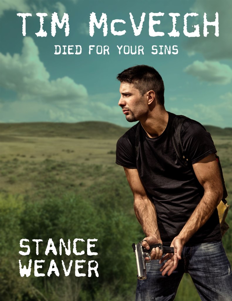
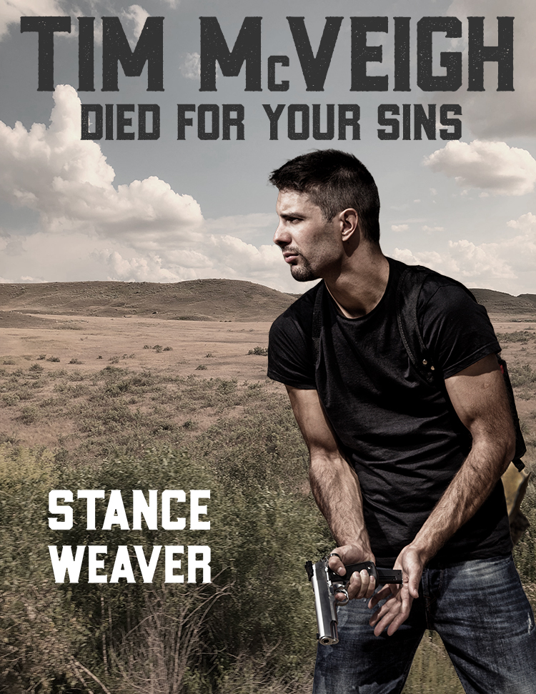
Now on Kindle: ‘Tim McVeigh Died for Your Sins’

Book cover for Tim McVeigh Died for Your Sins, a Kindle Vella serial available on Amazon. The cover shows a photo of a sexy young man loading a handgun as he stands against the rolling plains of Montana. The story is writtten by Stance Weaver.

When former Army Ranger Jeff Wilson tries an experimental stimulant, his senses are heightened, and his physical performance is amplified. Soon, this black market hustler is on the radar of terrorists plotting to blow up dams across the United States and frame him for the attacks. Can Jeff stay alive long enough to prevent this nightmare?

I had fun writing this fast-paced action yarn as “Stance Weaver.” More than anything, “Tim McVeigh Died for Your Sins” is a road story — the kind of adventure I love. “On the Road,” “It’s a Mad, Mad, Mad, Mad World,” “The Canterbury Tales,” “The Odyssey,” “Vanishing Point,” “Honky Tonk Freeway,” and “Two-Lane Blacktop” are all favorite road stories of mine.

Our lives are a road story: We’re born, we travel, we die — and spend a lifetime on a highway without benefit of a map. As Billy Joe Shaver sings: You drive or you ride, you fight or you die, somehow you survive on the highway of life.

Not everone in my serial survives, however.

Read the first three episodes of “Tim McVeigh Died for Your Sins” for free.

Coke beats Pepsi for Christmas

I prefer Pepsi-Cola to Coca-Cola but when it comes to Christmas, the soda pop from Atlanta beats Pepsi cold.

When you think of Coke, your mind fills with images of Santa Claus, Christmas trees, polar bears, and homecomings. And it doesn’t stop there. Coke also rides the coattails of the Fourth of July, free enterprise, youthful idealism, and, above all, of America the beautiful.

What do you get from Pepsi? Memories of a day at the beach, a Russian tailgunner brandishing a Pepsi bottle from his perch on a Tupolev Tu-95 “Bear” bomber, and Joan Crawford.