7 thoughts on “Should typecasts have a standard format?”
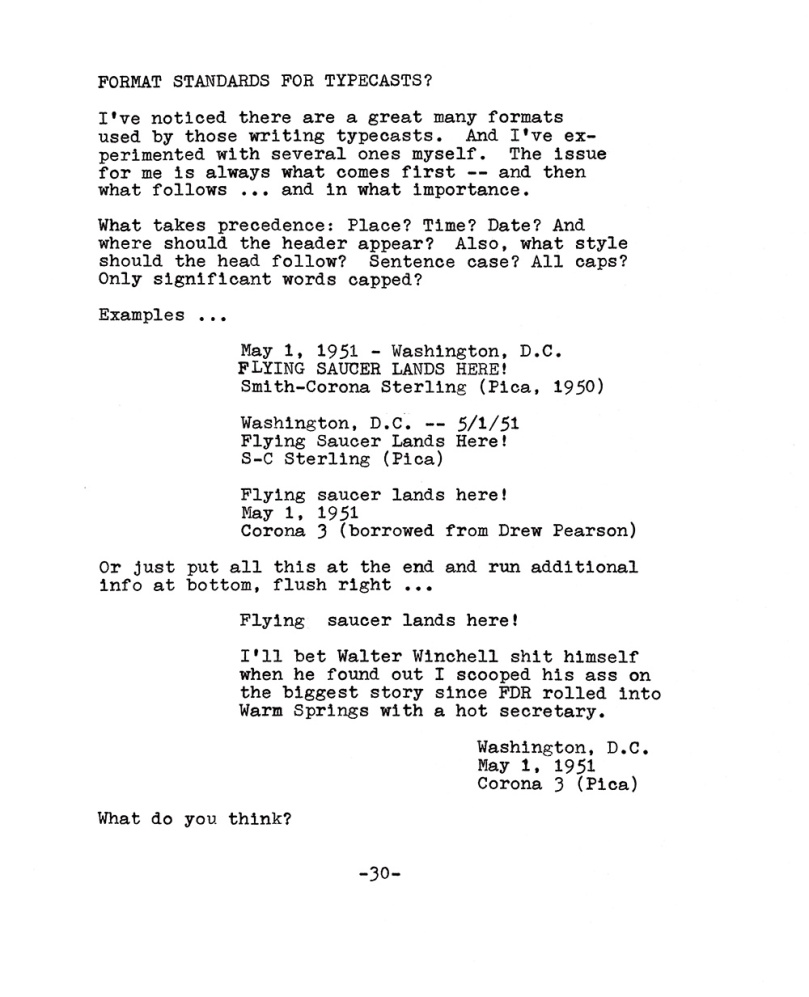
Something I wonder about myself. There is no one right way, I suppose. When I started this I would just use a simple heading of date, title and typewriter – three lines. Lately I have been going with date and place (where I am typing/writing from).
For yours, I like your first example with changes.
Title with first letters in caps (Title format)
Date and place with month abreviated (avoids day/month confusion)
Typewriter and vintage (Type size is visually evident)
I’ll vote for number 3. Regardless of medium, writing is about communication, and the metadata shouldn’t take pride of place. (Although I do want to see it.)
Regarding what typewriter information to include: I care most about make, model, and data of manufacture. I disagree with Mike–after type has been scanned and resized, type size is virtually impossible to determine. Only the relative size and shapes of the characters remains consistent. Fortunately, I don’t care much about the type size unless I own the typewriter!
Good points, John. I also wonder about what image file size and resolution is best? I’ve settled on JPEG at 1000 pixels wide and 72 ppi, optimized at the smallest file size that keeps artifacts to a minimum.
Good question! My thoughts on size and resolution are also unfinished, but here they are:
– Almost everybody has enough bandwidth now that a 500 kB file isn’t noticeably slower to download than a 50 kB file, so unless your image is huge, the main factor to consider is how quickly you want to risk filling your blog host’s storage quota. I find that images of 100 kB provide plenty of detail.
– Until recently, most screens and monitors had between 72 and 105 pixels per inch. High-res displays typically scale images and don’t require them to be high-res. Also, blog posts are typically not printed, so the ppi figure doesn’t matter. Your rule of thumb should work fine.
– Typed text of more than 40 or 45 characters per line becomes difficult to read on a smartphone.
My own practice: Limit line length; resize to 600-800 pixels wide; ignore ppi.
I really want to read the rest of the saucer story. Also the FDR story. And Winchell’s reaction.
My blog has a pretty skinny format (around 600px wide) and I like the typeface to be fairly large, so I use 3″ to 4″ margins and trim to the text area. As for machine attribution, I tend to use a photo at the top with a “Weapon of Choice” link to the machine’s entry at TWDB, where I’ll also backlink to the blog posts I’ve used that machine on. This allows people go go down the rabbit hole if they want to.

Something I wonder about myself. There is no one right way, I suppose. When I started this I would just use a simple heading of date, title and typewriter – three lines. Lately I have been going with date and place (where I am typing/writing from).
For yours, I like your first example with changes.
Title with first letters in caps (Title format)
Date and place with month abreviated (avoids day/month confusion)
Typewriter and vintage (Type size is visually evident)
Anyway, my 2 cents
LikeLike
I do like the title in caps. It’s also a great way to show how precisely a typewriter is in register!
LikeLike
I’ll vote for number 3. Regardless of medium, writing is about communication, and the metadata shouldn’t take pride of place. (Although I do want to see it.)
Regarding what typewriter information to include: I care most about make, model, and data of manufacture. I disagree with Mike–after type has been scanned and resized, type size is virtually impossible to determine. Only the relative size and shapes of the characters remains consistent. Fortunately, I don’t care much about the type size unless I own the typewriter!
LikeLike
Good points, John. I also wonder about what image file size and resolution is best? I’ve settled on JPEG at 1000 pixels wide and 72 ppi, optimized at the smallest file size that keeps artifacts to a minimum.
LikeLike
Good question! My thoughts on size and resolution are also unfinished, but here they are:
– Almost everybody has enough bandwidth now that a 500 kB file isn’t noticeably slower to download than a 50 kB file, so unless your image is huge, the main factor to consider is how quickly you want to risk filling your blog host’s storage quota. I find that images of 100 kB provide plenty of detail.
– Until recently, most screens and monitors had between 72 and 105 pixels per inch. High-res displays typically scale images and don’t require them to be high-res. Also, blog posts are typically not printed, so the ppi figure doesn’t matter. Your rule of thumb should work fine.
– Typed text of more than 40 or 45 characters per line becomes difficult to read on a smartphone.
My own practice: Limit line length; resize to 600-800 pixels wide; ignore ppi.
I really want to read the rest of the saucer story. Also the FDR story. And Winchell’s reaction.
LikeLiked by 1 person
My blog has a pretty skinny format (around 600px wide) and I like the typeface to be fairly large, so I use 3″ to 4″ margins and trim to the text area. As for machine attribution, I tend to use a photo at the top with a “Weapon of Choice” link to the machine’s entry at TWDB, where I’ll also backlink to the blog posts I’ve used that machine on. This allows people go go down the rabbit hole if they want to.
LikeLiked by 1 person
I like the idea of linking to the TWDB. I’ve been negligent in adding my machines, so I’ll need to get started on that. Thanks, Reverend!
LikeLike