7 thoughts on “Ladies and gentlemen: This is Magnatype!”
Heh, it drives like a truck, I bet. I had a ’54 SCM Silent Super with 6-Pitch that I felt the same way about. That escapement going “chunkka-chunkka” hard enough to always be trying to scoot off the desk.. 😀
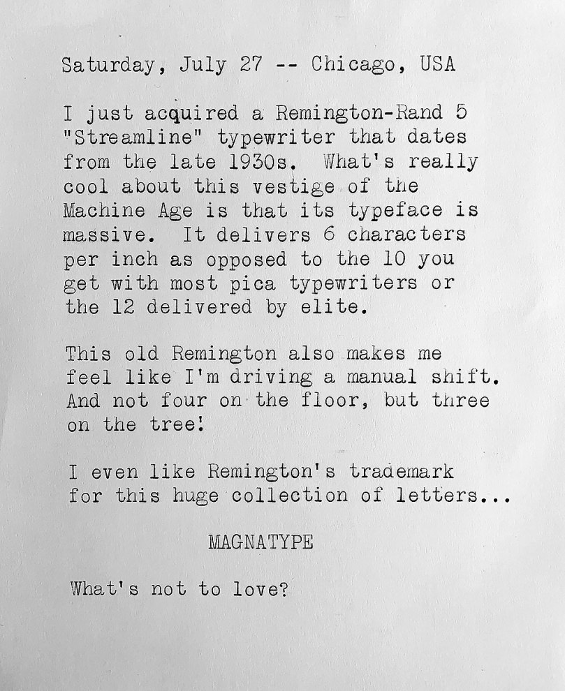
You definitely know it’s working! Despite the 6 cpi pitch, however, the Remington-Rand 5 is relatively small and lightweight — and its smaller-than-expected ribbon spools make it look almost toylike.
The smaller typeface is a bit like the internet in the late 90s, early 00s. The body text was set really small. Nowadays, the trend seems to be to use much larger font size for body text. The Mangatype would be very fitting for today’s online readers.
I wonder if the larger type size you’re noticing is because increasing numbers of people now view online content with smartphones. I just wish that designers would stop overusing light gray type. I know there are some accessibility studies that suggest a traditional 100 percent black type on 100 percent white background is difficult for some visually impaired readers and should be avoided — but I can’t imagine a light gray type on a slightly less gray background is idea for anybody.
Wow! Super lovely. This is one of the machines on my list! I love these Remingtons for drawing with and it would be so great to make art with the magnatype! I have a 6 cpi Smith Corona classic 12 with a wide carriage and the much simpler typeface the name of which escapes me yet again.

Heh, it drives like a truck, I bet. I had a ’54 SCM Silent Super with 6-Pitch that I felt the same way about. That escapement going “chunkka-chunkka” hard enough to always be trying to scoot off the desk.. 😀
LikeLike
You definitely know it’s working! Despite the 6 cpi pitch, however, the Remington-Rand 5 is relatively small and lightweight — and its smaller-than-expected ribbon spools make it look almost toylike.
LikeLike
Big is beautiful. Perfect for school /office noticeboards.
LikeLike
Perfect for my eyes – no need for reading glasses.
LikeLike
The smaller typeface is a bit like the internet in the late 90s, early 00s. The body text was set really small. Nowadays, the trend seems to be to use much larger font size for body text. The Mangatype would be very fitting for today’s online readers.
LikeLike
I wonder if the larger type size you’re noticing is because increasing numbers of people now view online content with smartphones. I just wish that designers would stop overusing light gray type. I know there are some accessibility studies that suggest a traditional 100 percent black type on 100 percent white background is difficult for some visually impaired readers and should be avoided — but I can’t imagine a light gray type on a slightly less gray background is idea for anybody.
LikeLike
Wow! Super lovely. This is one of the machines on my list! I love these Remingtons for drawing with and it would be so great to make art with the magnatype! I have a 6 cpi Smith Corona classic 12 with a wide carriage and the much simpler typeface the name of which escapes me yet again.
LikeLike